+

The brief
Develop a visual identity that captures the essence of sustainable motherhood whilst representing female strength, kindness and wellbeing. My Child’s Planet was born from a desire to inspire and drive change.
Their range of sustainable hospital boxes contains a carefully curated selection of sustainable products for new mums.
The boxes are a premium product, primarily aimed at eco-conscious mothers-to-be in the UK market.


What we did
To capture the sustainable nature of the boxes we made use of the circular shape the planet so perfectly provides - at it’s centre, we placed Mother Nature. The visual identity embraces the green you would expect to see in an eco-focussed brand, carefully combined with muted blue and yellow.
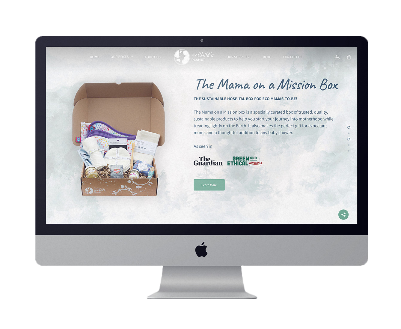
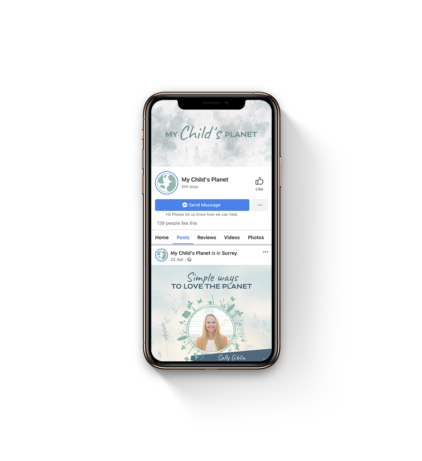
Texture plays a big part for My Child’s Planet - washed watercolour and recycled paper backgrounds nod to the sustainable packaging that customers can expect to receive their beautiful boxes in.
What we love most about this visual identity
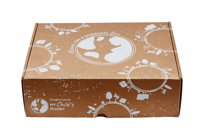
The packaging! We wanted to make an impact with as little ink as possible - we think the white on the recycled cardboard works beautifully.
“The way Big Gun has brought my brand to life has truly exceeded my expectations, such care for detail and beautiful design work.”

